READING & WRITING:
Chapter Nine – Animate!
Animation is a task that can seem intimidating, but there are tips to make it easier when you start, no matter the type of animation you are creating.
When animating, you want to plan well to make sure you have enough time to create every scene you need, so you do not have to cut scenes to save time later-on when other issues arise. With my logo stinger animation, while there is only one proper scene, I still needed to plan my schedule, so I had enough time to create and animate every element of my logo. I ended up running into issues trying to export out a final MP4 that took me longer than I had expected, only to realize a small section of my animation had accidentally been cut when watching back my MP4. (My dog was only blinking once, when she should blink twice! The double blink is very important). I did not plan on this setback, but because I planned my schedule well, I still had time to fix the animation (so there is the appropriate number of blinks).
Another tip is that you want to make sure to mix up shot length and timing throughout the film. For things like graphic animation, different elements of the animation can mix up their length and timing. In the animation of my logo stinger, each element of it is animated on its own time. While some elements do move at the same time, the speed of movement changes as for what is needed for each element.
One last tip for animation is to be flexible with your soundtrack. Something that works in the beginning may not work later, or you may come upon something that works even better. When doing the sound design for my logo stinger, I experimented with a few different dog panting sounds before finding one that fits well with the animation.
Blazer, L. (2016). Chapter 9: Animate. In Animated Storytelling: Simple Steps for Creating Animation and Motion Graphics (pp. 129–139). essay, Peachpit Press.
RESEARCH TO INFORM:
In animation, there are 12 different principles that an animator should keep in mind:
- Squash and stretch
- Anticipation
- Staging
- Straight ahead Action and Pose to Pose Action
- Follow Through and Overlapping Action
- Slow In and Slow Out
- Arcs
- Secondary Action
- Timing
- Exaggeration
- Solid Drawing
- Appeal
Some examples of these being used within animation are:
This clip is from the show Adventure Time, it shows the character Marceline. Her character design is a good example of follow-through and overlapping action with how her hair moves. Marceline is the vampire queen and so can float which she does commonly. Due to this, her hair is shown as flowing, even if she is standing-or floating- still. It is also just a fun little clip to watch.
This clip is from the show the Owl House, it shows the main character Luz auditioning to get into Hexside School of Witchcraft and Demonics. The whole clip is silly and worth a watch, but the link starts at 1:03 where, for reasons, Luz gets her eyelash caught in her eye and is temporarily blinded, causing her to slip on water that is melting from the ice she created on the stage. She starts to slip before catching herself but still falls back into a cape she had used previously. She becomes trapped in said cape and is blinded again, causing her to panic and run off the stage and right into the lap of the principal. This is an example of exaggeration, because instead of simply having Luz fall on her back or butt, she has a spectacle of a fall. (Don’t worry, she still passes the audition).
This clip is a witch’s duel from the Owl House, it is a good example of staging to create a dynamic fight scene. The scene shows two sister witches dueling, cutting between wide and close shots to make it clear what they are doing but also puts emphasis on certain actions or elements that are important to the story. The link should start at the beginning of the beginning of the fight scene at 1:23, and the fight sequence is over at 3:35. At this point it turns to dramatic backstory reveals.
This is a clip from the movie Emperor’s New Groove, from about the 3 second mark to the 7 second mark of this clip you will see an example of squash and stretch with how Emperor Kuzco reacts to having his groove thrown off. The whole clip is worth watching for a giggle.
The introduction for the show Big City Greens uses secondary action to introduce each character and give a feeling for their personality. For example, at about 7 seconds the main character Cricket is posing and showing off his nonexistent muscles, before a frog suddenly jumps out of his front pocket. This same method is used to introduce other characters. It is cute and I think it is worth watching the whole thing.
CREATE:
While I have made several different logos for myself for portfolios, I have yet to make myself a proper logo. All the portfolio logos I’ve made were just my name, and did not supply much to animate. I did initially consider trying to animate the letters of my name, but I felt like it did not have enough design elements to make an engaging animation. So, I decided to look at logo templates for ideas.
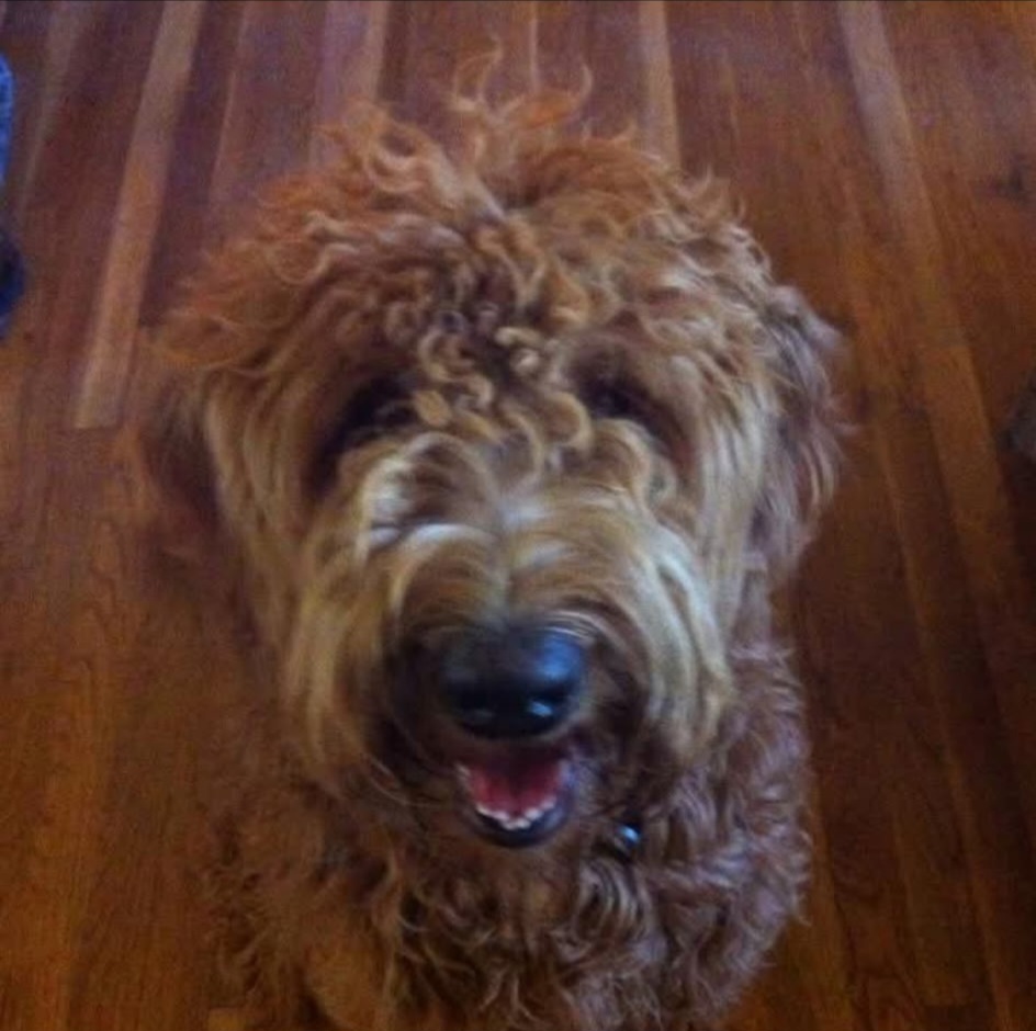
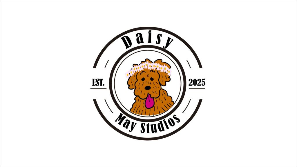
I ended up finding a logo template with a cow, I liked it a lot and decided to make it my own. Even though I do like cows, I decided to switch the animal to a dog and make my own graphic for the middle. The name and inspiration for my logo comes from my dog Daisy May, a golden doodle who passed away a while ago. I have a specific way of drawing her as a cartoon that I thought would be perfect for the center of a logo.
Once I had a logo design that I was happy with, the animation part was easy. Something that I was not sure about was the exact timing for the movements. From researching other logo stingers, I knew that the total length of the whole animation did not necessarily need to be super long, but I wanted the speed of the movement to look natural. This is where the audio became useful; by making the movement of each element the same length as the sound effect accompanying it, makes the animation look believable.
Something that I considered as I was creating this animation was the 12 principles of animation. For all the movement, I used pose-to-pose-action by setting the ending points and then the starting points for each element. Adobe After Effects was able to fill in the frames in between the points that I set. I applied secondary action to the text by having the title circle around and then the “est. 2025” comes flying in second. Secondary action is also applied when the dog blinks her eyes twice and her tongue pants at the same time. Squish was used in the animation of the eyes blinking and the tongue panting to give the animation a more realistic look. Appeal was also brought into consideration of the total look of the piece. The dog is a simple cartoon style that is meant to be cute. (Also, how can you get more appealing than a dog in a flower crown? You can’t. You can’t get more appealing than a dog wearing a flower crown).
By considering the principles of animation in the design of my logo stinger, I was able to create an adorable logo stinger.
