With how prevalent mobile phone use in within the modern day, it is a commonality for websites to have companion mobile applications. While not everyone currently has a laptop or desktop, most people have a mobile phone that they use to access the internet. Most mobile phones do have a web browser, but they are difficult to navigate due to the small screen. By giving websites companion applications, it makes the information that the app provides easier to navigate for the user, especially while they are on the go.
Information architecture is the theoretical framework behind the structure of a website and the relation between the areas of a website. The information architecture informs the sitemap, or structure of a website. Even though these principles were written for website design, they can also be applied in the development of a phone application.
Whether you are designing the structure for a website or a phone application, the value in applying the principles of information architecture to remain the same, to create a successful structure that is easy to navigate and user friendly. How these principles help to clarify structures can be seen by designing a phone companion application for Long Beach’s website, based upon the newly suggested sitemap of the last post.
Principles of Information Architecture Recap
- Principle of Objects-Content has predictable behaviors a user can rely on.
- Principle of Choice-Have meaningful choices for the navigation options.
- Principle of Discloser-Show only enough information to the user so they know what they are navigating to.
- Principle of Exemplars-Show examples of the contents of pages.
- Principle of the Front Door-Expect at least half the users to access the website from a page other than the homepage.
- Principle of Multiple Classifications-Offer multiple ways for users to find content.
- Principle of Focused Navigation-Have focused navigation options.
- Principle of Growth-Leave room for the content of the website to grow.
For a more detailed explanation of each of these principles, look to my previous blog post about website information architecture.
About the Long Beach Website

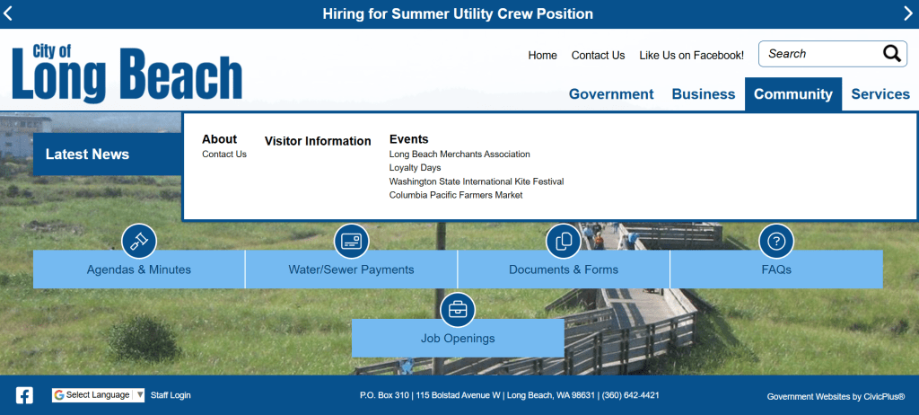
The point of the Long Beach website is to give information for government, businesses, and services for local residence. While the options will not be as robust as the options in the website’s sitemap, the options that are available were chosen based on what would be most useful for both residents and tourists.
App Information Architecture

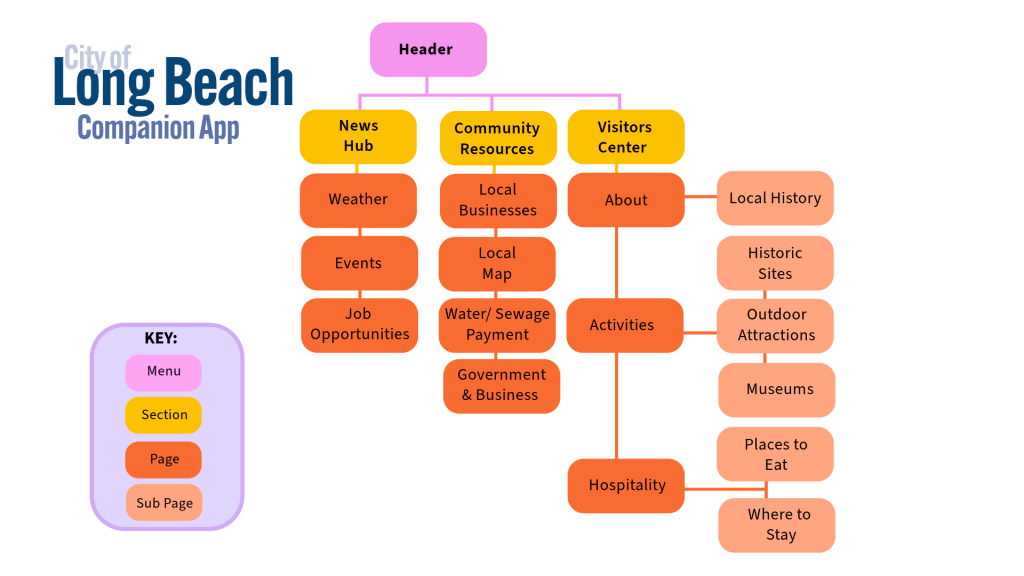
The new main navigation section is focused into three sections: News Hub, Community Resources, and the Visitor Center. The sub-pages for each section are chosen based on what will be meaningful and be most useful for residents and tourists. For example, the Government & Business section lead to the website in a browser, in case any of the resources needed. The government functions are still available, but not the focus of the app.
If you’re headed to the beach, then the “Weather” page will tell you about the weather to expect. Another example that was kept from the original information architecture is “Water/Sewage Payment,” which can link to the bill payment site in a web browser from the app.
The app structure has a lot of the same subpages, but they are focused down to what would be most useful for people. Whether or not the user is a local or a visitor, they can find what they need from the website on the app. Like the sitemap for the website, this sitemap includes just enough information for the user to navigate. There is room for the content of the app to grow alongside the Long Beach website.
Final Thoughts
The goal of the Long Beach companion app is to provide information that is useful for people. By focusing on the functions that are most useful and the most meaningful to users. A successful companion app for the Long Beach website could be created that is not only easy for users to navigate but also helpful to them.
