Introduction
When creating a phone application, a designer needs to make sure that the app will be valuable for its users. If the app is too difficult to navigate or is not helpful, then no one is going to use it.
The Long Beach municipal website’s companion app, the Long Beach Gull, is designed to be useful for both the residents and visitors. Residents will be the main users of the app, so the News Hub and Resident Center sections have resources they may need to access on their phones. Similarly, the Visitor’s Center has resources that a visitor may need to access on their phones.
A concern that may arise is whether visitors will be willing to download an app just for a visit. Tourists will often ask residents for recommendations. If a resident suggests an app that is useful then a tourist is likely to download it. However, locals aren’t going to suggest an app that they don’t find useful. A tool to help ensure a user interface (UI) is effective is user flow.
About User Flow
User Flow is a representation of the different ways to navigate a website or application. These representations can be written or graphical. They can be useful to create interfaces that are intuitive, evaluate existing interfaces, and model an interface to coworkers or clients.
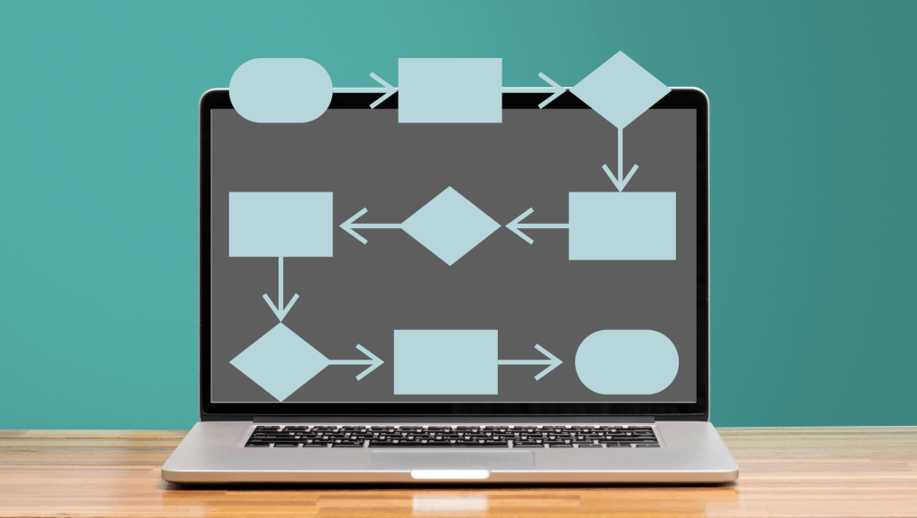
Whether text or a graph, user flow is made up of three essential parts:
- The entry point: where the user accesses the website or app.
- The steps to completion: the course the user takes to complete the intended task. This is the core of user flow.
- The final interaction: Whether the user completed their task.
Text-based user flow will describe the path that user takes, while User Flow Graphs will visually demonstrate the user’s path using the following elements:
Rectangles represent a page or display screen; they are typically the most common element used. These are best for modeling pages like home pages and onboarding screens.
Circles portray an action, a task to be completed or steps to be taken. These are often labelled with verbs, such as “Start”, “End”, or “Select Item.”
Diamonds display a question or decision for the user. Lines extending from the diamond will show the path to follow.
Lines with Arrows take the reader through the chart, showing the actual flow of the chart. Due to this, it is the most important part of the chart.
To demonstrate how user flow assists in app development, it will be applied to the Long Beach Gull, by outlining three different user cases and creating flowcharts to determine if these users would be successful in obtaining their goals in the app.
Testing Users
To test the ease of navigation for app, three different user stories were applied.
Barbara: A local business owner who needs to be able to pay her bills on her phone.
Joshua: A local resident who wants to be more connected with local news.
Lucy: A visitor to Long Beach who is trying to find a place to stay, where to eat, and figure out what she will do while in the city of Long Beach.
Each of these potential users had their paths that they would need to take to achieve their goals written out, then diagramed into visual representations as flow charts.
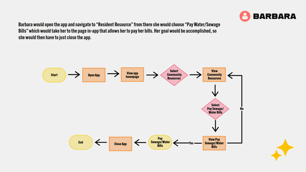
Barbara’s path was very straightforward, since she has one simple task: to pay her water and sewage bills. The app provides a very easy way to achieve this, it is just a few simple taps on the phone. No changes to the app UI had to be made for her to easily able to achieve her goal.
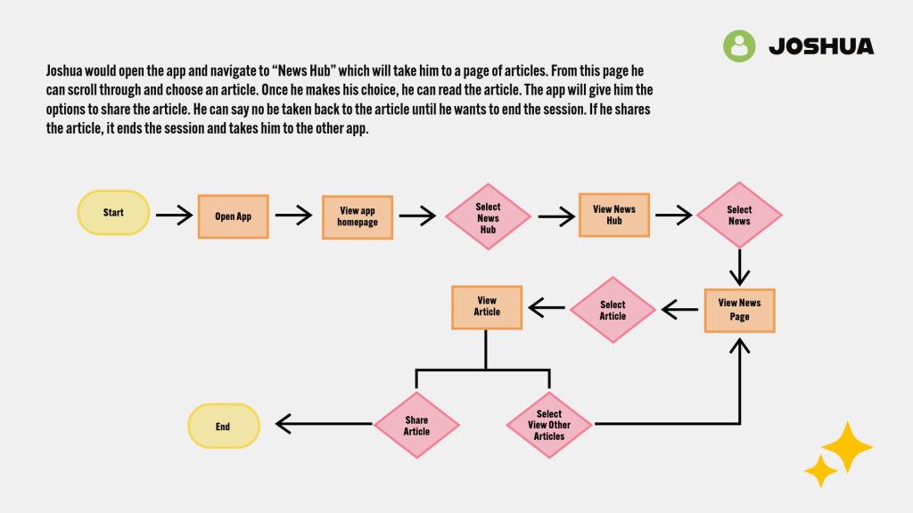
Joshua’s path on the site could potentially go for a long time, depending on how many articles he wants to read. So, his flowchart shows the path he would take to read an article, but to also go back and read more. In case he wants to come back to an article at a later point, the app gives the option to bookmark articles so the user can come back to it easily. Joshua’s flowchart did bring attention to a place where the app’s UI was lacking. At first, the News Hub page was lacking a proper “News” page to host the local articles. This had to be added to the app’s UI. Once it was, Joshua was able to achieve his goal.
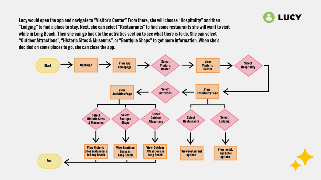
Lucy has the biggest flow chart, because she has the most do while in the app. The other users had one task, while she has three tasks to complete. The options in the app do make it easy for her to find the information she needs. Like Barbara’s flowchart, no changes had to be made to the app’s UI for Lucy to obtain her goal.
Final Thoughts
User Flow Charts provide simple visual exercises to test out the information architecture for a website or application. By simulating users for the Long Beach Gull app information architecture, I was able to see any errors in the UI. While Barbara and Lucy were able to complete their business without any adjustments to the UI, Joshua’s flowchart helped to point out a missing page.
