Introduction
When designing any product, the developers want to make sure that people will want to buy or use their products. However, they do not want to have to spend money by pushing out multiple versions of the final product. A way to avoid having to create multiple versions in post is to go through the different versions while the product is in development. The problems with a product can be worked out during the prototype stage through user testing.
User Testing vs. Usability Testing
User testing is the process of using real users to evaluate products, such as an app. The goal is to validate different aspects of the product before the final stages of the development process. It does this by gathering feedback on the overall user experience, identifying bugs, and understanding what the user expects and will be satisfied with.
Often used interchangeably with user testing is usability testing. While these concepts are related, they are different aspects of the testing process. User testing is the broader term that refers to the different ways that developers may test the functionality of a product with real users. User testing itself is focused on making sure the app helps the user to obtain their goals. Usability testing is a type of user test that focuses on refining the actual experience of the user. This fine tuning is achieved by giving users specific tasks to complete with the product, based on how real users may use the product.
User testing and usability testing are two different concepts, however how they relate to each other is how they work well together. User testing is about the functionality of a product while usability testing is about the experience of the user. These concepts can be combined by using real users to test a product to not only check that the users can complete their goals, but to see how the user’s experience could be improved. How these concepts can be combined for app development was put into practice through the development of the Long Beach Gull.
Testing the Gull
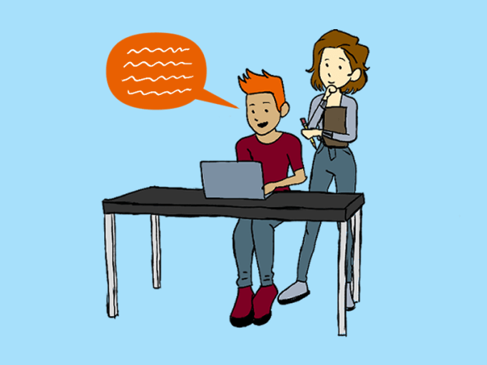
The Long Beach Gull (affectionately nicknamed the Gull) is a companion app to the Long Beach, Washington’s town municipal website. A paper prototype of the app was created, first using physical paper. The physical pages were then photographed and then put into a prototyping-on-paper (POP) app called Marvel to create a working digital POP. A link to the POP of the Gull was sent to two test-users. The users were chosen based on accessibility and familiarity with Long Beach. Both users who were tested were familiar with the city of Long Beach.
The Users were both given two different brief context descriptions, and a few tasks to complete with each description. The tasks the users were asked to complete were as follows:
Context Description 1 Imagine you are planning to visit Long Beach. A friend of yours suggested this app, to help with your planning.
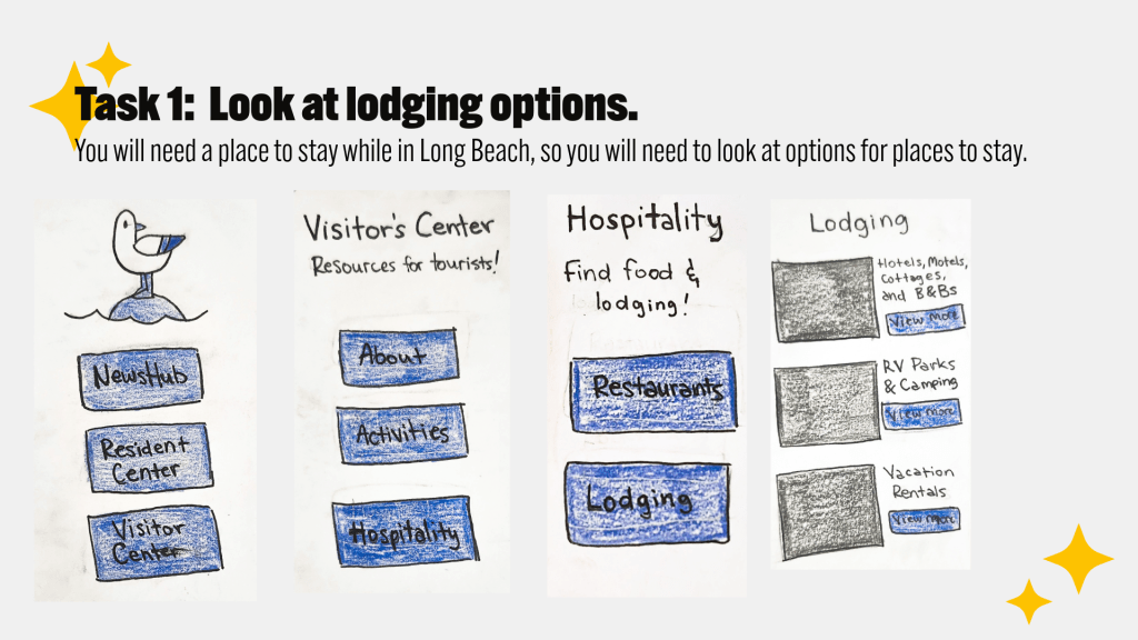
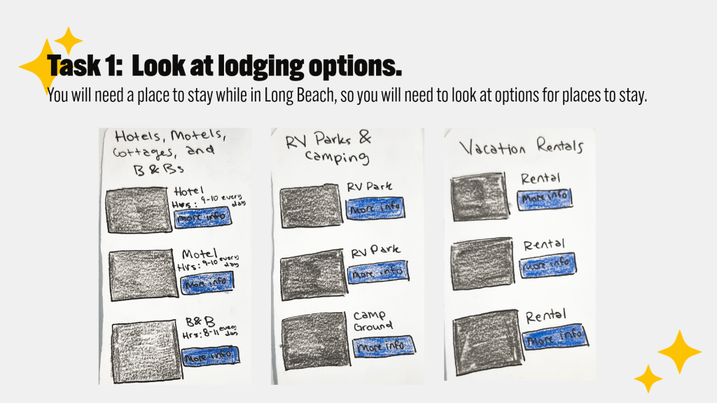
Task 1: Look at lodging options on the app for a place to stay.
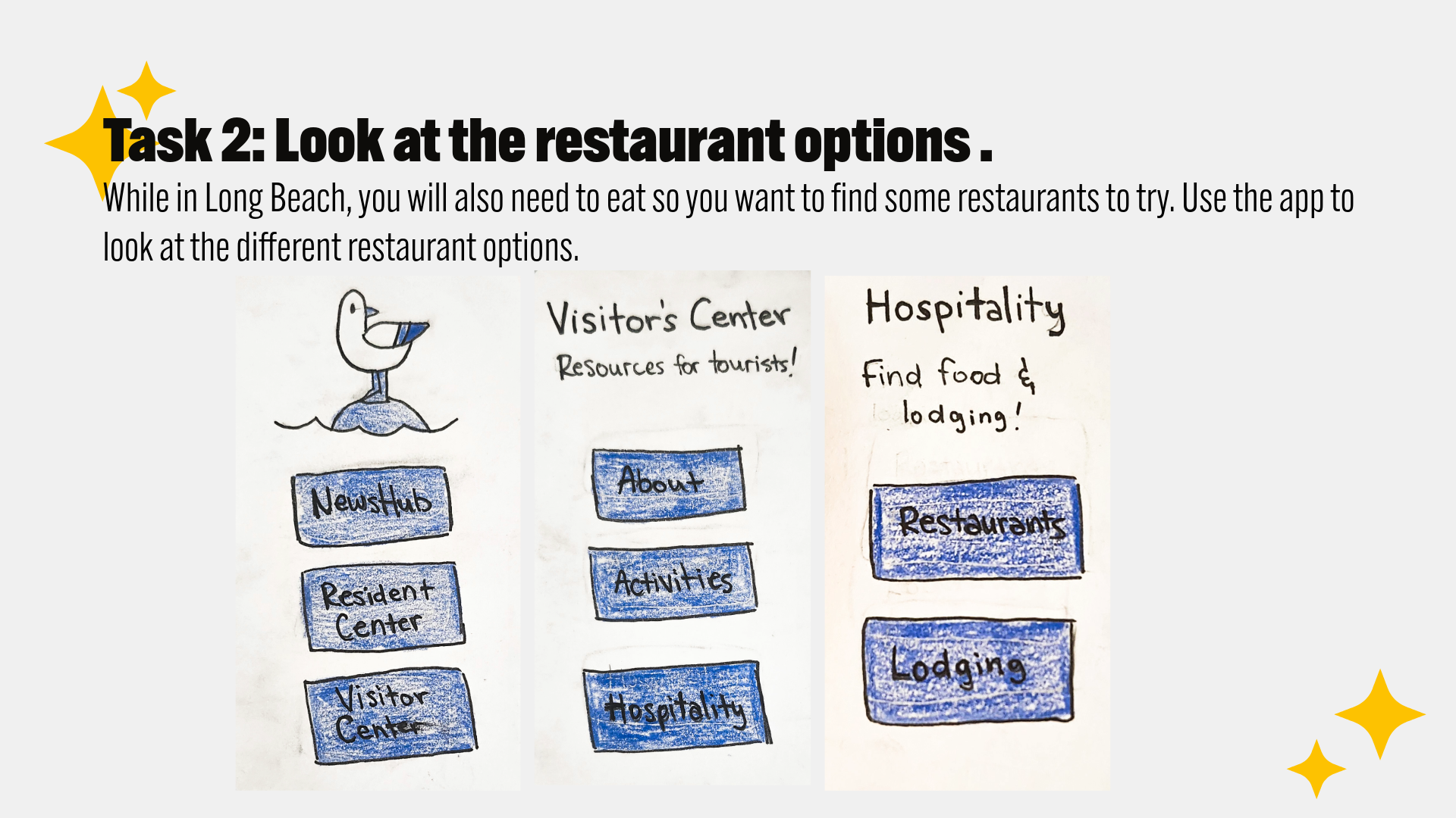
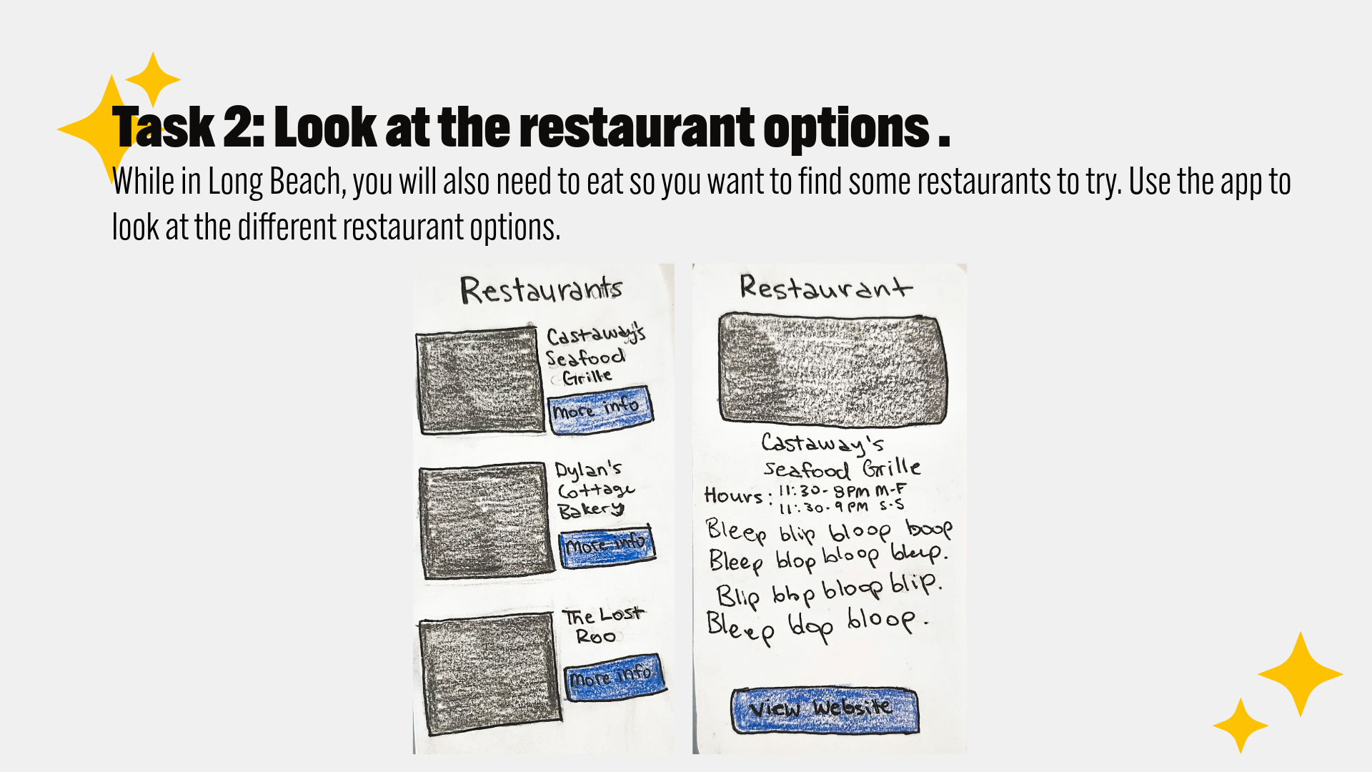
Task 2: Look at the restaurant options for a place to eat.
Task 3: Look at the Activities page for some things to do while visiting Long Beach.
Context Description 2 Take on the role of a local resident of Long Beach.
- Task 4: Check the local news articles.
- Task 5: Check the local weather.
- Task 6: Check out local events.
Feedback from the Users
The user testing yielded good results; from the testing I found that the prototype functions and found weaknesses in the user experience. Both users were able to complete all the tasks asked for, but there were suggestions from the users to improve the app:
- Wind and Thunderstorm warnings for the weather.
- A map in the Visitor Center
- Having public restrooms labelled on the map, including ones where you may change your baby.
- Have free parking marked on the map as well.
The state of Washington has a lot of rainy weather, thunderstorms and windstorms. One of the users suggested that the weather app has a section dedicated to storm alerts. A different suggestion from a user was for the Visitor Center to also include a map for ease of access.
For the Visitor’s map, users also suggested that the map includes markings for public restrooms, restrooms with diaper changing stations, as well as free parking. Visiting families will find these features helpful.
Observations of the User Experience
The users were not the only ones who noticed elements that could be improved during the testing. As an observer of the testing, I was able to notice the following issues:
- When asked to check the weather, User 1 first went to the Resident Center, but self-corrected and found the correct page.
- Neither user testers triggered the “share article” pages.
- User 2 kept clicking trying to click everywhere.
After being given the first of the second set of tasks, User 1 first went to the Resident Center page. When they saw that this page lacked the right option they wanted, they went back to the Home page and instead tried the News where they found the Weather option. User 2 on the other hand, went right to the News Hub page and found the Weather option easily.
When asked to complete task 2, neither Users triggered the “share article” pages. While I had hoped these pages would be seen, triggering these pages was not included in the instructions. So, I decided to just move on with the testing rather than interfering with the user. At one point I did interfere with User 2 when there was trouble getting their phone to trigger the pages. While not ideal, this was still seen as necessary to make sure the prototype was functioning as it should.
As User 2 was completing their tasks, they tried to proceed through the app by clicking on various spots. They were still able to complete their tasks easily. However, I thought this was something that could be improved. There could be more clickable points in the interface of each page. For example, only the “view more” buttons link to the next subpage. The titles of different subpages could also lead to the subpage so the subpage can be navigated to from both points.
Final Thoughts
By combining both user and usability testing, it was possible to find that the current paper prototype of the Long Beach Gull app is functioning, as well bring attention to the areas of the Gull that could be more successful. Having two real people use the app to complete the intended tasks in the app showed that the current concept does work, as well as pointing out where the user’s experience could be made easier. A hybrid of both user and usability testing was used to successfully develop the Gull further to a place where a higher fidelity prototype could be created.
References
Strba, M. (2024, May 22). User testing vs. usability testing. UXtweak. https://www.uxtweak.com/usability-testing/differences-user-vs-usability-testing/
Bland, J. (2024, December 13). Prototype user testing – step-by-step guide for 2025. Articles on everything UX: Research, Testing & Design. https://blog.uxtweak.com/prototype-user-testing/
