Something that I have been a fan of for a long time, but that has continued to elude me in using properly, is color. While I do love using it, I often feel that the way I use it in my own work could be improved. Using color properly is important because it plays a key role in graphic design.
Cathy Caldwell describes it as the “lifeblood of graphic design” in her book, Graphic Design for Everyone: Understand the Building Blocks So You Can Do It Yourself. This is because color often sets certain designs apart from others, catching our eyes and holding our attention. From this, designers may ask why these colors catch our attention. The answer to this question lies within the psychology of color.
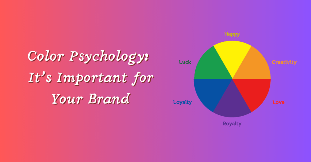
What is the psychology of color?
Psychology of color is the study of how color affects human behavior (Maybray, 2022). Knowing how colors affect human behavior is important for designers, as it helps them anticipate how viewers will react to their designs. For example, if someone wants to design a color scheme for a fast-food restaurant, then that designer may want to specifically use colors that people associate with hunger, such as reds, yellows, and oranges
Researchers have found consistency in people’s responses to colors: warmer colors such as red, orange, and yellow are stimulating, while cooler colors such as blue, indigo, and violet are calming (Caldwell, 2019). This knowledge can help in decision-making, guiding a designer in choosing a color palette based on the desired feeling the designer wants a viewer to experience. Choosing a color that does not match the desired feeling can mean an unsuccessful design. For example, a waiting room painted a bright, fiery red may not be the most calming. While a waiting room that is white with a bright blue accent wall might be more fitting. This is because the room is intended to be calming, so it is a better fit with the calming colors.
Another influencing factor in people’s perception of color is an individual’s interpretation of its meaning. A great example of this is red; in China, it is considered lucky, while in South Africa, it is the color of mourning (Caldwell, 2019). This shows two very different meanings for the same color across cultures. This is why the meaning of a color can be a very important consideration while designing. Since there are so many variations in color interpretation, it is important to research any possible color meanings for the target audience.
Why is it important?
Color is important in branding because it often affects a customer’s first impression of a product. Research has found that not only do 90% of first impressions come from color, but 93% of consumers make their purchasing decisions based on visuals (Maybray, 2022). I know that in my own consumerism, I will often go for the product that I find most visually appealing. This is important to keep in mind when choosing colors for a design. If you choose unappealing colors, that won’t help consumers choose your product. Despite this, no color palette appeals to every single consumer you come across. This is why it is important to research the meanings of the colors you use to your target audience. If the colors you have chosen are not appealing to the exact people that you are trying to appeal to, then you are not going to find success.
Another way that color can impact your brand is by increasing brand awareness by 80% (Maybray, 2022). Think of how, when you are in the soda aisle at the grocery store, you can just, by glancing at it, recognize the telltale red that is the signature of Coca-Cola, or, if you see a deep blue, you know you are looking at Pepsi products. While this is just one example, it still proves the importance of color within brand awareness.
By being mindful of the emotional effects of colors and their cultural associations, a designer can use color more effectively to create successful designs.
Color Psychology with Savona Coffee House
For Savona Coffee House, the suggested color palette uses red, green, white, black, tan, and brown. The newly proposed logo for Savona uses mainly black for the tower’s shape, with the accent colors, green, white, and red on the flag that pokes out of the right side of the tower. While it is meant to be the Italian flag, it can be advantageous to consider the possible meanings associated with each color in Savona’s color palette.
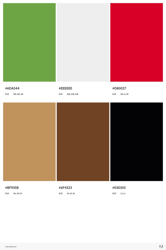
Red is commonly associated with empowerment, passion, energy, love, strength, heat, danger, and alertness. Green is commonly associated with optimism, tranquility, luck, jealousy, naivety, and fertility. White is associated with youth, hope, rejuvenation, purity, sterility, and sincerity. Black is associated with self-confidence, power, mystery, authority, negativity, exclusivity, and mourning. Brown is associated with comfort, seriousness, resilience, safety, nature, solidity, masculinity, and sadness (Caldwell, 2019). Similarly, tan is associated with calm, comfort, warmth, and stability (Braam, 2025). These meanings of these colors are important to consider in relation to Savona’s branding. These interpretations of the colors within the palette can potentially interfere with customers’ perception of Savona’s brand.
While there is no way to guarantee knowing every single customer’s perception beforehand, it is still possible to keep general associations in mind. It is the hope that customers will have more positive associations with the colors used, such as passion, energy, and love with red. Optimism, tranquility, and luck with green. Rejuvenation, hope, and sincerity with white. Comfort, safety, and resilience with brown, and calm, warmth, and stability with tan. These values associated with Savona’s color palette also align with those Savona hopes to cultivate within its brand. By using a color palette that aligns with Savona’s brand values, they can reinforce both the brand values and the intended associations of the palette’s colors. This can then help reinforce Savona’s brand awareness. Whenever customers see these colors together, they will think of Savona.
Conclusion
Color can elicit very different reactions due to differences in culture and individual perception. By being aware of this, graphic designers can use color more effectively in their designs to get the desired reaction from customers. By applying color psychology and being aware of the possible meaning associations customers may have, Savona can more effectively use its color palette to reinforce not only its brand values but also brand awareness.
REFERENCES
Caldwell, C. (2019). Understanding Your Brand. In Graphic Design for Everyone: Understand the Building Blocks So You Can Do It Yourself (pp.72-73). essay, DK Publishing.
Maybray, B. (2022, August 16). Color psychology: How to use it in marketing and branding. HubSpot Blog. https://blog.hubspot.com/the-hustle/psychology-of-color
Van Braam, H. (2025, March 28). Shocking facts about tan color meaning & psychology revealed. Color Psychology. https://www.colorpsychology.org/tan-color/
