Data has been called the new oil, as it is a resource found everywhere, shaped to drive innovation and insights. Data journalist David McCandless, in his TED Talk, challenges this idea, instead comparing data to soil, as “it feels like a fertile, creative medium.” A lot can be done with this fertile creative medium, but to do anything with it, it is important to understand it first.
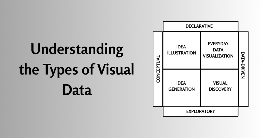
In visual data, there are four main types of information visualization: conceptual-declarative, conceptual-exploratory, data-driven-declarative, and data-driven-exploratory.
Visual data can be conceptual, meaning it expresses an idea, or data-driven, meaning it expresses a statistic. It is either declarative, which means it communicates information, or exploratory, which means something is being figured out (The Complete Medic, 2024). Therefore:
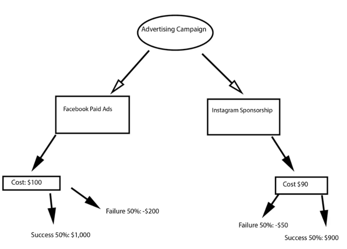
- Conceptual-Declarative, also known as idea exploration, expresses an idea and communicates that information. It clarifies complex ideas by drawing on metaphor and simple design, and thus requires a clear, simple design with a logical structure. Examples include hierarchical designs and decision trees, such as this Advertising Campaign decision tree, which weighs the options of Facebook Paid Advertising versus Instagram sponsorship. It includes the most important factors for both, which is the initial price, the potential profit for a 50% successful campaign, and the potential profit loss for a 50% unsuccessful campaign. From this, the Instagram Paid Sponsorship has a lower initial price and a lower loss from an unsuccessful campaign, but the Facebook Paid Sponsorship has a higher potential profit from a successful campaign.
https://blog.hubspot.com/marketing/decision-tree
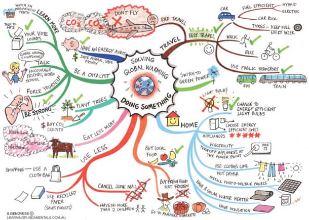
- Conceptual-Exploratory, also known as idea generation, relies on metaphor and is for finding new ways of doing things, or can offer support while answering complex questions. This type of data visualization is best for brainstorming or creating a strategy. Examples include mind maps, such as this one on different actions an individual can take about global warming. It clearly outlines actionable steps someone can take to reduce their impact on global warming.
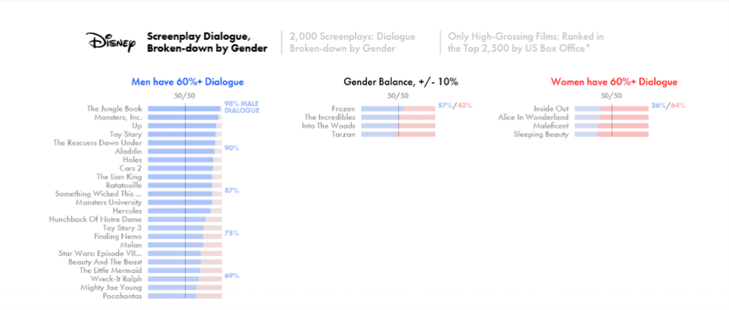
- Data-Driven Exploratory, also known as visual discovery, is used for complex data sets, and is the category most scientific research falls into. Within it are two domains: visual confirmation, which tests a hypothesis and seeks to answer it by finding the best way to depict the idea being tested. On the other hand, visual exploration seeks patterns and trends to uncover new insights by presenting the data in multiple ways. An example comes from this study that was done, looking into find data to prove or disprove the claim that white men dominate movie roles by looking at Disney Movies. This is a great example because it provides the number of screenplays they analyzed, then shows a bar chart showing how much of the dialogue in each analyzed film was spoken by a male or female character. The data sets are also divided into whether the movie dialogue was 60%+ spoken by a male character, 60%+ spoken by a female character, or a middle section with less than 10% margin of spoken by either male or female characters. From this graph, it can be seen that most Disney films included in this study have male-dominated scripts.
https://pudding.cool/2017/03/film-dialogue
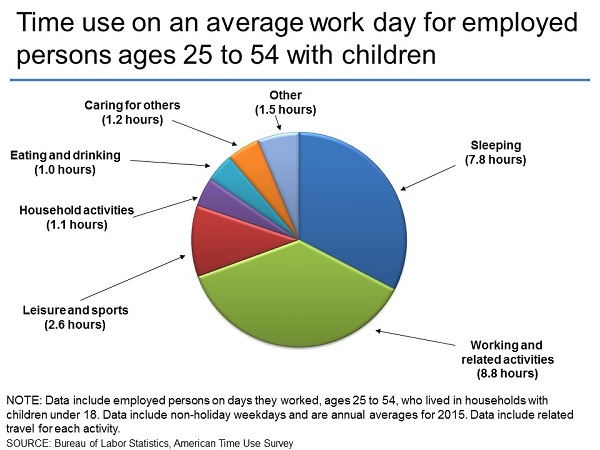
- Data-Driven Declarative, also known as everyday data visualization, refers to basic charts and graphs that can be easily made to understand data. These are usually simple and involve small amounts of data to provide context in presentations. An example of this type of data comes from the Bureau of Labor Statistics and the American Time Use Survey. This pie chart shows how time is spent on an average workday by employed folks aged 25 to 54 who also have kids. It clearly shows and labels each section and even includes a note at the bottom to provide further context about the chart.
As David McCandles puts it, data is the new soil; it is a fertile, creative medium. It is all around us. However, just because it is all around us does not mean that everyone knows how to use it. By being able to understand the different types of this soil, conceptual declarative, conceptual exploratory, data-driven exploratory, and data-driven declarative, you can effectively use them and shape them to create innovation and find new insights.
REFERENCES
McCandles, D. (2010, July). The Beauty of Data Visualization [Video]. TED Conferences.https://www.ted.com/talks/david_mccandless_the_beauty_of_data_visualization
The Complete Medic. (2021). Introduction to data visualization. The Complete Medic. https://thecompletemedic.com/research/data-visualisation
 Home
Home 