READING & WRITING:
Chapter Two – Storytelling
A cohesive story has a structure, whether it is a three-act structure, which is a story where the arc is told within three distinct parts, or a nonlinear structure where the writer creates their own structure. While animations often use three-act structures, motion graphics use a nonlinear structure.
This is because an animation needs a clear beginning, middle, and end. While motion graphics are trying to get a message across, whether said message is the name of a production studio or a PSA. For example, with my personal introduction video I used a nonlinear structure since my objective was to tell the viewer about myself.
Chapter Three – Storyboarding
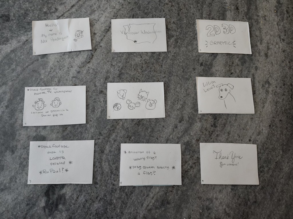
All animated stories start out as a storyboard. A storyboard is a basic visualization of a story’s arc that uses thumbnails, which are rough drawings of the different scenes of a story. This helps animators to have a plan of what they need to create, so they have an idea of what the finished project will look like. For example, I used a storyboard to help plan out my personal introduction and it helped me to create an asset list.
As development goes on, changes will be made to the storyboard such as shot composition (the setup of shot that reveals information to the viewer), framing (keeping the eye interested in what is on screen), and staging (where you place the subject and other objects in relation to the camera). In my own storyboarding, I tried to keep these elements in mind to create an engaging animation.
Chapter Four – Color Sense
An important aspect of planning a story, especially an animation, is the choice of colors. The colors used in a piece can have a profound effect on it. This is why animators often use color scripts. A color script is a sequential visual outline of how an animator intends to use color in a film. Color scripts help the animator plan out how they will use color to emphasize key moments in a story.
For example, in my personal introduction video I initially had a simple grey background. I was thinking this would help emphasize images and text, but it was instead lackluster. Due to this, I changed the background to a light blue denim texture, which contrasts with other colors in the video and looks more polished. For cohesion I also applied a blue filter to all the footage I used in my video as well.
Blazer, L. (2016). Chapter 2: Storytelling. In Animated Storytelling: Simple Steps for Creating Animation and Motion Graphics (pp. 17–35). essay, Peachpit Press.
Blazer, L. (2016). Chapter 3: Storyboarding. In Animated Storytelling: Simple Steps for Creating Animation and Motion Graphics (pp. 37–53). essay, Peachpit Press.
Blazer, L. (2016). Chapter 4: Color Sense. In Animated Storytelling: Simple Steps for Creating Animation and Motion Graphics (pp. 55–69). essay, Peachpit Press.
RESEARCH TO INFORM:
This video is a brief animation of the history of coffee. Even though this animation uses graphics much more than text, I still think it is effective. The images that are shown are captivating and visually tell the same story as the audio. Also, I appreciate the history lesson.
This is the showreel for Cloudwalk Motion Pictures, an animation company. While text is not used as much as graphics in this video as well, it still shows a variety of ways that graphics can be animated.
This animation is a kinetic typography of a dialogue from Toy Story. Not only is the text animated, but graphical elements are also used to make the animated text more engaging. I feel as though it uses both text and graphics equally to engage the viewer.
This is another kinetic typography video, the audio used is from Anchorman. Like the last typography video, it uses graphics to make the animation of the text more interesting. Unlike the Toy Story kinetic typography, this video uses animated text more than animated graphics.
This video is a showcase of all the different ways that kinetic typography can be used along with animated graphics to create fascinating animations. While the video itself is rather fast paced for the sake of showing a variety of animation techniques, it is still very successful in retaining the viewer’s attention
CREATE:
I used Adobe After Effects to create my Personal Introduction itself but used other programs to create some of the assets for it. Certain elements of it are stock footage, such as the imagery when talking about my hobbies and goals. I recorded the narrative audio and footage of my dog using my phone while the stock footage and background denim texture I found on pexels.com. The background music I found on bensound.com. The graphic images I use I created myself in a different program called Clip Paint Studio. I turned them into PNGs and Photoshop files to bring them into Adobe After Effects.
To animate my text, I used some of the Animation Presets that Adobe After Effects provides, while most of the images I key framed their movement. Specifically for the shape of state of Washington and the star on it to show where Vancouver is, I used Animation Presets to see how they worked with graphics. For the footage, I used a filter preset to make it blue to connect them with the background of the rest of the video.
All my chosen images, footage, and audio successfully introduce myself and gives the viewer a feeling of my personality. The motion effectively maintains viewer’s attention and is appropriate for each graphic.
