
In the modern age, the internet is a very common way to share information. Due to this, it is important to present information in a structured and clear way. If users come across a page that is confusing, unorderly, or just difficult to use they are not going to come back. To create a website that users want to come back to, developers should consider information architecture.
Information architecture is the theoretical framework behind designing the structure of websites. Defining the overarching systems and relationships between the areas. This instructs the sitemap, which shows the form, hierarchy, content, and functionality of a website. Navigation is how the user is guided to the pages of the site using links.

Despite the prevalence of the internet, the theory of information architecture is still considered to be in its infancy. So, it has yet been any books written on the subject. What does exist is a set of principles which offer guidelines for what is good information architecture. These principles help refine structure designs to be as clear and user friendly as possible; creating a successful structure.
How these principles build good information architecture can be seen by deconstructing an existing website and reworking it to better apply the principles. Before these principles can be applied, these principles need to be defined.
8 Principles of Information Architecture
- The principle of objects is to treat the site’s content as a living thing. Meaning that content has recognizable structures and behaviors you can predict. For example, a user sees a picture of a house or the word “home” on a website and knows that the button will take them back to the homepage of the website.
- The principle of choice is to create pages with meaningful options, focused on a particular task. Do not overwhelm the user with too many possibilities for pages or ones that seem unrelated.
- The principle of discloser is to show only enough information for users to understand the content they will find if they dig deeper into the website. Like how you do not want to overload your user with too many options, you do not want to overload your users with information either.
- The principle of exemplars is to describe the contents of categories with examples. Essentially, just show people what is inside the section. For example, streaming services like Netflix and Hulu will often show multiple movie options inside a grouping to show users exactly what type of movies are in the genre.
- The principle of front doors is to assume that at least half of the website’s users will not come through the home page. When a user is searching Google, they may find just a specific page of your website rather than the home page. This means that each page must show what is available on the rest of the website.
- The principle of multiple classifications is to offer users multiple ways to find content. This rule comes with a caveat, as you do not want to overwhelm or distract the user either.
- The principle of focused navigation is to make sure your navigation options make sense and go together. In other words, you want the menu to offer a clear strategy for navigating the website.
- The principle of growth is to assume the content of the website will only expand. This is helpful as it gives room not only for more content, but more and new categories as well by anticipating the growth of the website.
To see how these principles work in action, it can be useful to look at existing websites and see how they have applied these principles. The Long Beach, Washington town municipal website provides a good opportunity to evaluate the information architecture and see how it can be improved.
About the Long Beach Website
Long Beach, Washington is a little town on the coast of the Long Beach Peninsula. It is known for its beautiful beach, but also the shops in the town, historical sites, and outdoor attractions. It is a very lovely little town to visit, my family used to go there each summer to visit. I always had fun visiting there. Since I have a personal connection with Long Beach, I chose its website to analyze.
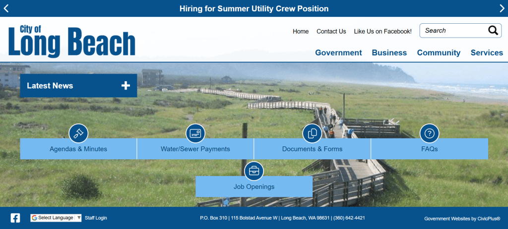
The town municipal website for Long Beach is much less fun than the town itself, the website is focused on business functions, government, and services for locals. It has one main header navigation section that is available on every page, and has the options of Government, Business, Community, and Services. While these are all straightforward options, the principles of information architecture could be better applied to the structure of the website. As it currently stands, I only notice the principles of growth and the principles of front doors are applied to the website.
Current Information Architecture

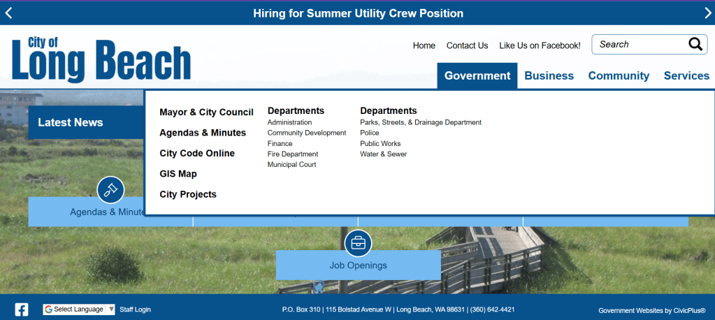
Two principles that I can be better applied are the principles of choice and focused navigation. Under Community there are the sections: about, visitor information, and events. The about page is honestly confusing because it just leads to a contact page rather than any information about Long Beach. Visitor Information leads to a whole new website that has tourist information that is shared by multiple small towns to display all the tourism options on the Long Beach Peninsula. It does not even lead right to Long Beach’s page; the user must navigate to it. This does not seem like the most successful way to display this information.
Looking at the town municipal website for bigger towns, such as my hometown of Vancouver, Washington and the neighboring city of Portland, Oregon, the function of these websites is also Business, Government, and Community. They also all have separate websites that give information for visitors. However, Vancouver and Portland are both big cities that have their own tourist websites, rather than shared ones. The tourism information for Long Beach is already contained on a single page, but there is a better way to present it.
New Information Architecture:
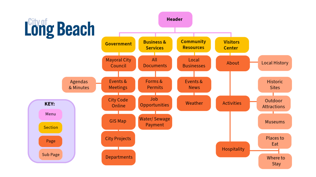
For a new Information Architecture, the original functionality of Long Beach’s website is being kept in mind, resources for government, business, locals, and visitors, but the resources could be reorganized and displayed better. I reordered them to Government, Business & Services, Community Resources, and the Visitor Center. This change is to make each section clearer, but also to make the choices more meaningful.
Business & Services are combined because the sections are not only related, but these were also very small sections on their own, which did not make sense. Separating the Community and Visitors sections gives both sections room to grow.
A particular problem I had with the original website layout is the Visitor Information page being a link to another website where the user must navigate to the correct page for Long Beach. While the link could link to Long Beach’s page itself, the visitor’s page could be hosted on Long Beach’s website itself. Rather than being hosted on a shared site. It is distracting to link to a whole new website; it would be more focused to have all the information about Long Beach contained on one dedicated website. The proposed sub-pages will also give users a good amount of information about what is available in Long Beach without overwhelming the user either.
With this refurbished Visitor Center section, the outside shared tourism website could stay as well. The information could be used on both websites, making it more accessible. The Visitor Center page linked directly to Long Beach’s page of the tourism site, that would be more user-friendly.
Final Thoughts:
A town municipal website is something that is typically not going to be very exciting, but it can still be aesthetically pleasing. By applying an information architectural framework, websites can be made not only easier to navigate but easier to understand. Long Beach’s current information architecture is focused more on government and business functions. While these are useful, there are missed opportunities with their Community and Visitor sections.
The proposed change to the sitemap takes advantage of these opportunities to make it more focused, gives more meaningful choices to users, and still even gives more room for the site to grow.
More information about Long Beach could be featured on the website, and the shared tourist website could work together to advertise about not only Long Beach but the whole Peninsula. The information could be featured on both websites, making it accessible as possible for tourists.
References
Brown, D. (2010). Eight Principles of Information Architecture. Bulletin of the American Society for Information Science and Technology, 36(6), 30–34. https://doi.org/10.1002/bult.2010.1720360609

Leave a reply to Rethinking Information Architecture Part 2: The Long Beach Companion App – Home Cancel reply