When you create a design, you want to make sure that it looks appealing. A good way to make sure a design looks good is to use a successful composition.
Composition in design refers to how elements of a design are arranged. Knowledge of composition is needed to create a successful layout. One way to create a successful composition is to use a grid.
A grid in design is an invisible structure beneath your layout that helps organize elements. Grids are beneficial in design because they establish a logical structure that helps the audience find the same information across multiple pages, and they enable the designer to work faster and more efficiently. A pre-established structure saves a designer time by telling them exactly how to place everything on the page. The type of grid to use depends on the amount of content, the number of pages, and the project’s medium.
The different types of grids are as follows:
- Single Column: the simplest layout, containing just one column. It is best for text-heavy documents.
- Multiple Columns: a page divided into multiple columns. The more columns, the more options for organizing text and images. Adjusting the spacing between columns will affect the layout’s look and feel.
- Modular Grid: uses columns and rows so the grid works horizontally and vertically. Each block and the space between them are the same size, and the blocks can be squares or rectangles.
Alignment refers to the lining up of two or more elements along a margin or other line. This line is usually invisible; it is implied by the arrangement of elements. Using alignment helps show connections between elements, establish an obvious, easy-to-follow flow, add visual appeal, and use space efficiently.
With layouts, there are three different types of alignment:
- Left alignment: when different elements of a design align with the left edge.
- Center alignment: when different elements of a design align along the center.
- Right alignment: when elements of a design align with the right edge.
Alignment does not just apply to the layout; it also applies to text. When aligning text, you have four similar options:
- Left aligned text: when text is aligned along the left edge.
- Right aligned text: when text is aligned along the right edge.
- Center aligned text: when text is aligned along the vertical axis.
- Justified text: when text is aligned along both the right and left edges.
Depending on the program you are using, you may receive more text alignment options, such as Justified with last line aligned or justified with last line centered. This is because sometimes a final line can look unpleasing due to large gaps between words. Times like this may look better if the last line is aligned differently.
When someone uses alignment to show connections between elements, this is called grouping. Grouping can be achieved by enclosing elements together, using space to make it clear they’re connected, or showing similar items. This similarity can be through shape, color, or size.
Another important part of a successful layout is achieving balance. Balance can be achieved through a couple of ways:
- Symmetrical balance: when elements are arranged in the same way on either side of the central axis. It looks stable and controlled, but too much can be monotone.
- Asymmetrical balance: when elements are arranged differently on either side of the central axis. This form of balance is attention-grabbing, but it does require more work than symmetrical balance.
- Balancing colors: using heavier colors, like warmer ones, alongside lighter, cooler colors. For example, a focal point made of warm colors can be balanced by a cool-colored background.
- Balancing size: balancing larger elements with smaller elements and vice versa. For example, one large item balancing several smaller elements.
Grids and Composition in Website Design
A specific type of design where grid compositions are especially useful is website design. In designing a website mock-up for Savona Coffee House, a Vancouver, Washington-based coffee shop, I used different grid types depending on each page’s needs.
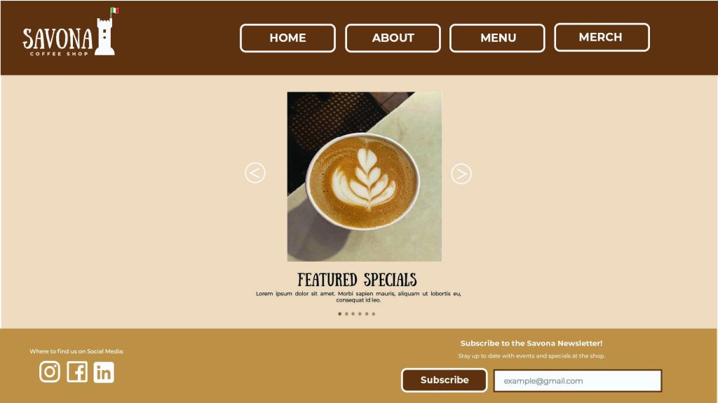
- The homepage uses a single-column grid structure featuring a carousel image viewer, where visitors can click the directional arrows to browse featured drinks and other specials. This page achieves symmetrical balance by having the arrows be identical on either side.
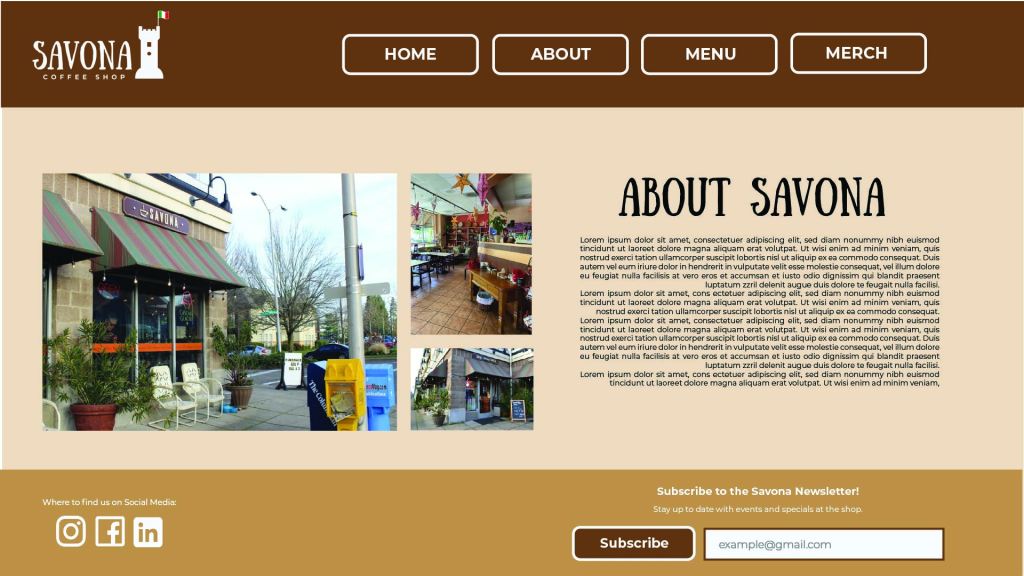
- The about page uses a two-column grid structure with justified text, with the last line of the text being right-aligned. This page achieves asymmetrical balance by having the photos balance out the text and heading.
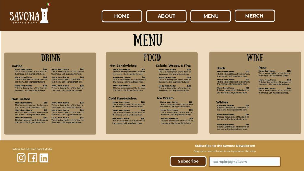
- The menu page uses a multiple-column grid structure to divide the menu into three columns. One column is left-aligned, one is center-aligned, and the last column is right-aligned. Grouping is used to organize the different items listed on the menu, as well as color to separate the different menu sections
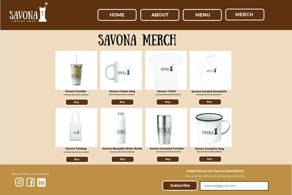
- The merch page uses a modular grid, featuring eight different sections for each merch item. All text on the page is justified with the last line centered. This page uses symmetrical balance with the spacing of all the items for sale.
- The header on each page also serves as the navigation bar, which uses asymmetrical balance. For the header, all the buttons take up most of the weight. This is balanced out by the size of the logo on the opposite side. For the footer, most of the weight is in the newsletter subscription sign-up box and the text above. This gets balanced out by the social media links on the opposite side.
Altogether, this presents a solid mockup for a website for the Savona Coffee shop that can easily guide the viewer to all the necessary information.
Conclusion
By effectively using elements of a good composition, such as grid structures, balanced elements, and proper alignment, a designer can create a successful composition. In the case of Savona Coffee Shop, these compositional concepts were used to create a mockup of a potential website for the business.
Reference
Caldwell, C. (2019). Understanding Your Brand. In Graphic Design for Everyone: Understand the Building Blocks So You Can Do It Yourself (pp.157-185). essay, DK Publishing.
 Home
Home 