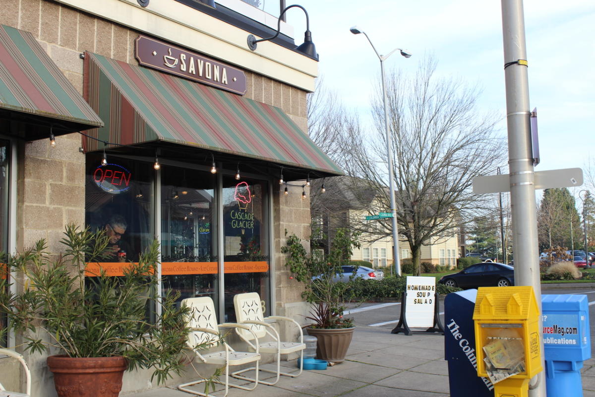
If you find yourself in the city of Vancouver, Washington, and visit the Columbia River, then you will also find yourself close to a little café called Savona Coffee House. There, they serve not only coffee and tea but also a variety of other beverages, pastries, sandwiches, ice cream, and even beer and wine. It is a privately owned establishment that offers a warm, cozy environment.
Other than views of the river from their outdoor seating, what sets Savona apart from competitors is its Caffe D’arte coffee, a specific Italian brand. As well as offering Cascade Glacier Ice Cream, a Northwest local ice cream brand. As well as plenty of wine, sangria, and other spirits. Savona’s namesake comes from the Italian seaport city of Savona, Italy.
In previous posts, potential redesigns of Savona’s logo and color palette, as well as a potential website design, have been discussed. However, these were all only elements of a total brand update.
Savona’s Current Branding
Before explaining how Savona Coffee House can be rebranded, it is important to first describe how it currently brands itself. Then it can be built up to be updated.
Verbal Style
The language Savona uses is very straightforward and tells customers exactly what they need to know. They try to maintain a friendly tone to emphasize the coffee shop’s coziness. Their brand story is that they are just a cozy coffee shop near the Columbia River waterfront, and they place great value on the community and serving it. Savona currently has no official slogan.
Visual Style
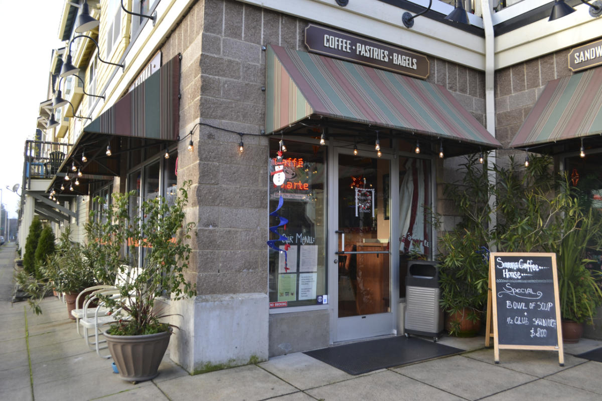
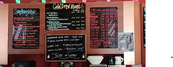
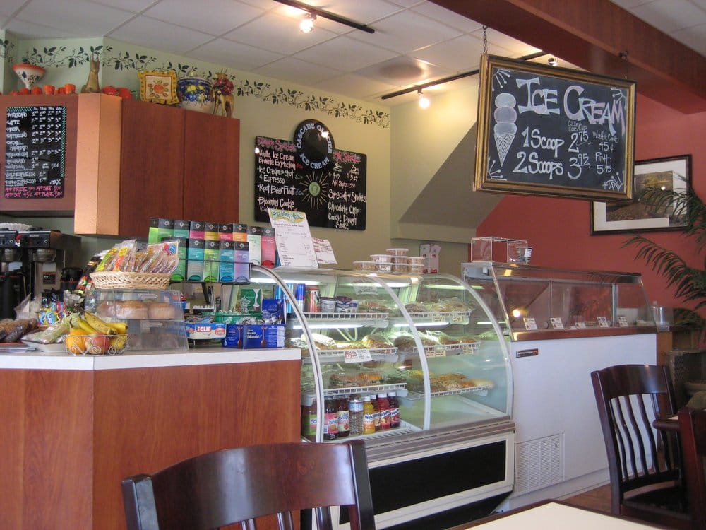
Visually, Savona expresses itself through a few different fonts. The sign on the actual building uses a sans-serif font along with their logo: a coffee cup on a saucer with a little steam rising from the top. Another sign that leads passersby on the sidewalk to the shop uses three different fonts. Most of the shop’s interior signage is in a hand-drawn script, adding to its homey feel. Despite the homey feel of Savona’s handwritten signage, the branding still lacks cohesion due to the use of various fonts in printed signs.
The color palette that Savona uses contains muted browns, reds, and greens. The browns are likely meant as a reference to coffee. While the use of reds and greens is likely a reference to the Italian flag, given the shop’s name’s Italian roots. Which does make sense for a coffee shop with Italian roots.
Updated Branding Proposal
While Savona’s current branding strategy makes sense for the shop, it could be updated and reinforced not only to make it more cohesive but also to help Savona stand out from competing coffee shops.
Verbal Style
The verbal style Savona already uses effectively emphasizes the shop’s friendly, cozy feel, helping achieve its brand value of community. This should be continued and could be expanded by emphasizing the brand story of its proximity to the waterfront. This will help in setting Savona apart from competing coffee shops. A slogan that Savona could adopt to reinforce its brand values of community and product quality is: “A place for friends and fine drinks.”
Visual Style
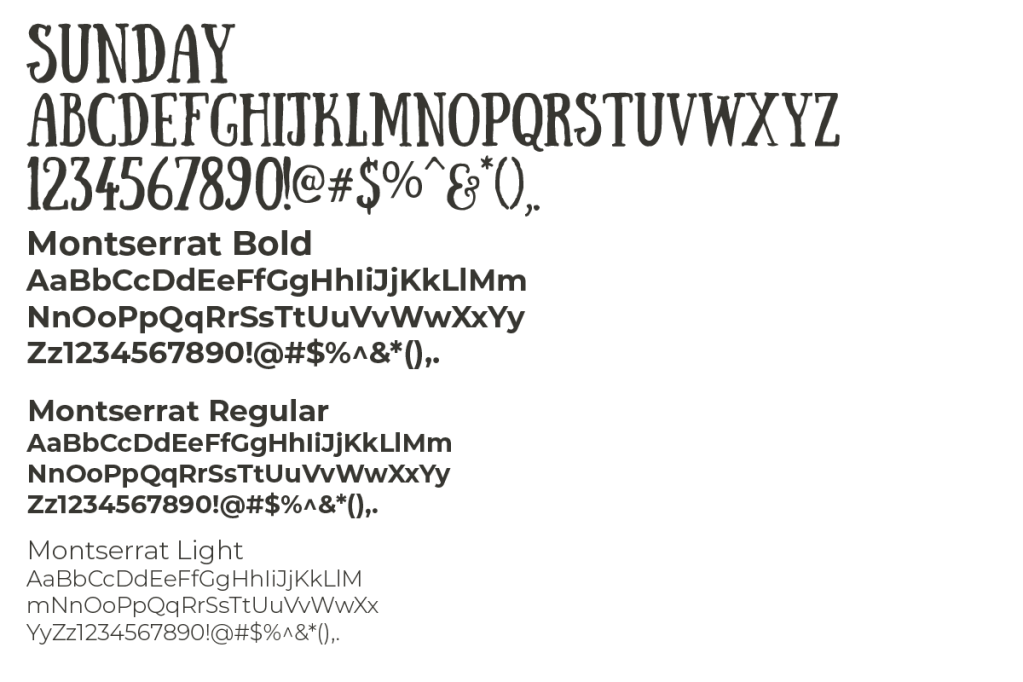
The handwritten signage that Savona has does not need to be changed; it can instead be reinforced in the branding. To be more cohesive with the handwritten signage already in the Savona shop, the suggested new typography for Savona headings is a handwritten display font called Sunday. To complement this font, Montserrat Bold, Montserrat Regular, and Montserrat Light are suggested for subheadings, body paragraphs, and subtitles.
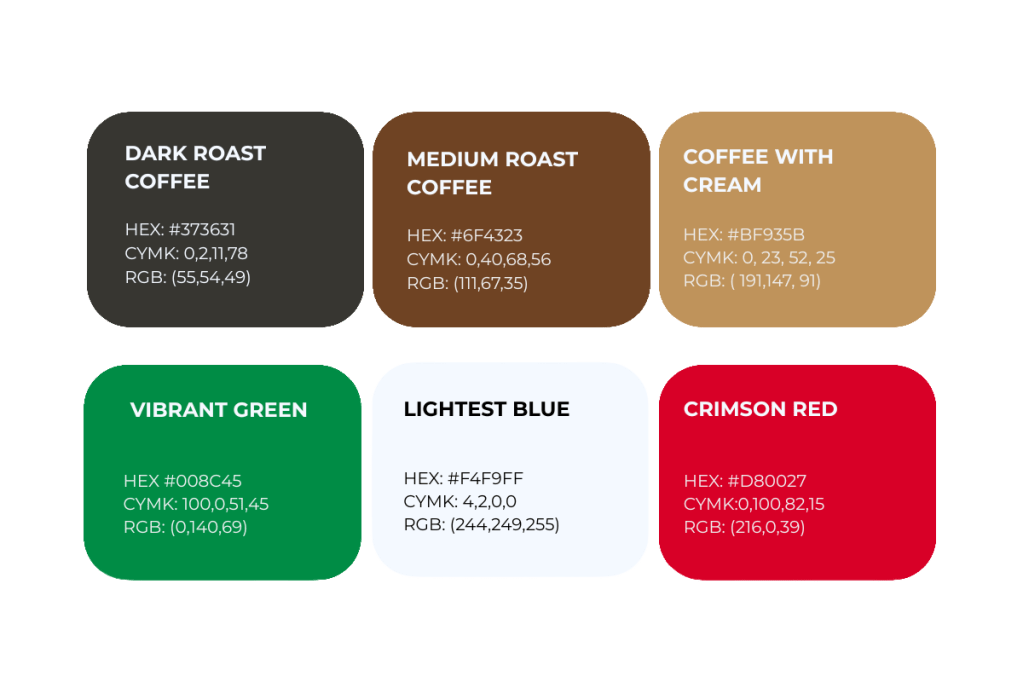
The new color palette suggested for Savona is similar to its original but has been made more vibrant to draw more attention. The colors of the primary palette are an off-black meant to mimic a dark roast, hence the name. Next are a brown meant to mimic medium-roast coffee and a tan meant to mimic coffee with cream. While the accent palette uses a vibrant green, a very light blue, so light that it appears white, and a vibrant red. Similar to Savona’s original color scheme, these colors reference the coffee shop’s Italian roots.
A New Logo
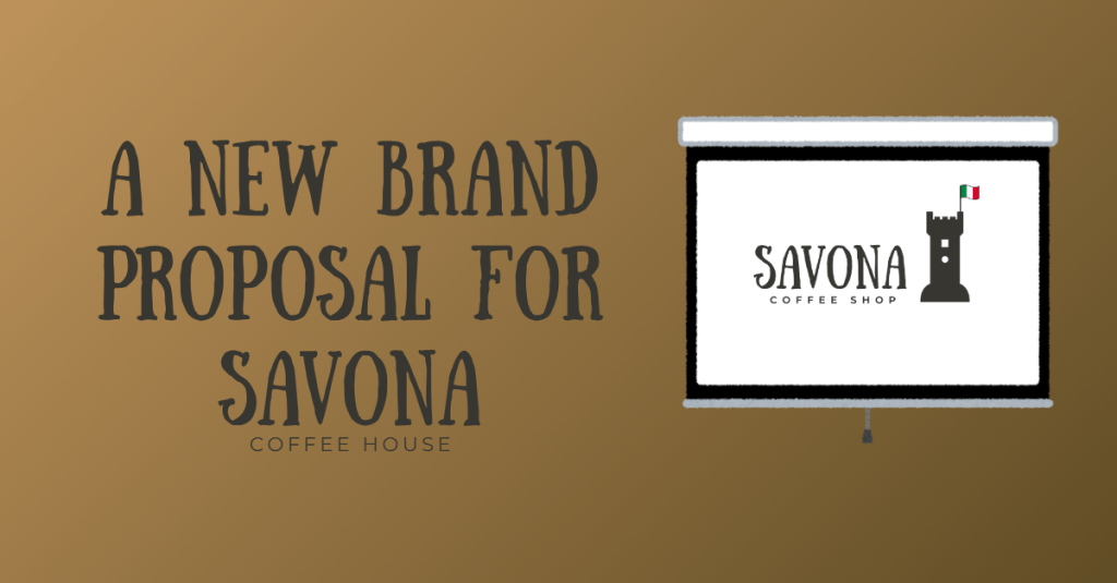
In a previous blog post, two possible redesigns of the Savona logo were discussed. From these two, one was selected and refined to reflect the final brand typography and color palette. The chosen design features a graphic of a tower, inspired by the Leon Pacaldo Tower, the symbol of Savona, Italy. By capitalizing on the coffee shop’s namesake for the logo’s symbolism, Savona can set itself apart from competing coffee shops. It is designed to be simplified to a single color while remaining legible.
Branding Items
With the chosen logo, color palette, and typography in hand, different branding items can be made that align with the established visual and verbal branding values. Some examples of such items include:
- Branding identity system: four designs for Savona-branded items, including a menu template, business card design, rewards card design, and several merchandise mockups with transparent images for creating the merchandise.
- Trifold brochure explaining Savona and what they have to offer.
- Newsletter, both a print and digital version, to keep customers up to date on different events happening in the shop. Depending on the customer’s format preferences.
- An example of a book swap event poster with different design options.
- A mockup of a four-page website for Savona Coffee houses.
All of these items are included in the proposal at the bottom of the post.
Conclusion
While Savona Coffee House’s current branding strategy successfully conveys its brand values of comfort and community, there could be greater cohesion in its fonts and a stronger focus on the shop’s proximity to the waterfront to set it apart from the competition. With the proposed changes to the logo, color palette, typography, and branding elements already created, Savona would have a more cohesive brand identity that a different designer could build on and expand in the future.
