A useful way to communicate information graphically is through data visualization. Data visualization refers to the creation of graphics to represent data and statistics (Unwin, 2020). It refers to any graph or chart that represents information.
A benefit of using data visualization with data and statistics is that they help text create a full, detailed picture (Unwin, 2020). This is because the added visualization, alongside the statistics provided, gives the viewer a more concrete understanding of the data. Alternatively, data visualization can be explained as “the representation of data in graphical form to simplify its understanding “(Schwab, 2021). Visually presenting the data in two ways gives the viewer another way to process the information than just the statistic itself. Thus, making it easier for the viewer to understand. These data visualizations are created using technology. Technology has presented advantages and challenges in creating data visualizations.
Benefits of Technology Advances in Data Visualization
A benefit of advances in data visualization technology is that new tools have enabled the graphical representation of complex quantitative data, making it more accessible and understandable across multiple disciplines, including cartography, medicine, and the social sciences. This has led to innovations in data visualization, such as thematic maps, statistical charts, and interactive maps, thereby enabling clearer communication of trends, relationships, and patterns (Friendly, 2008). This has allowed for the ways that people represent data visually to grow and change as it crosses disciplines.
Another benefit is that advances in measurement, data collection, and statistical theory have provided the foundation for more sophisticated analysis and visualization. The development of computers and software in the 20th century enabled the handling and visualization of massive data sets, supporting real-time analysis and dynamic graphics (Friendly, 2008). This helps simplify data collection, making it easier for analysts to transform it into a visual representation.
Another benefit is that advances in printing technology and, later, digital tools have made it possible to disseminate visualizations widely, thereby increasing their impact on government, science, and public policy. The creation of open-source software and interactive systems democratized access to advanced visualization methods (Friendly, 2008). This made it easier to produce bulk data visualizations to reach more people. As well as more people being able to create data visualizations themselves.
One last benefit of technological advancements in data visualization is the invention of new graphical forms, such as pie charts, scatter plots, flow maps, and 3D surface plots. Interactive and dynamic graphics have also allowed users to explore data in new ways, fostering discovery and insight (Friendly, 2008). Even with all the benefits of technological advancements in data visualization, there are caveats.
Drawbacks of Technology Advances in Data Visualization
A drawback of technological advancement in data visualization is that, during the early 20th century, visualization methods were ignored in favor of quantitative and formal models considered more precise than visual representations. This focus on numbers as facts led to few graphical innovations during this period (Friendly, 2008). People were relying on technology and the numbers they produced rather than the different ways to represent the data. Causing there to not be much movement in the world of data visualization.
Another drawback that came with the advancement of data visualization technology is that, as visualization methods advanced, they often require specialized knowledge or expensive technology, thus limiting access for people without the knowledge or the ability to pay. This is evident in the fact that early innovations, such as lithography and color printing, were costly, limiting the circulation of publications containing visual data (Friendly, 2008). Even though technological advancements made it more accessible for people, it only made it accessible to those with the required skills or money.
An additional drawback of advances in data visualization technology is the potential for new forms to be misunderstood and misused. As the accessibility of data visualization tools grows, so does the risk of poorly designed or intentionally misleading graphics that lead to the misinterpretation and misuse of data (Friendly, 2008). While this might be a drawback that
Levels of Data Visualization
With the advantages and drawbacks of data visualization in mind, let’s discuss what makes good data visualization. Before we do, let’s first address the five levels of data visualization. First is Level 0, which shows just data, no visualization. Level 1 data visualization is a static representation and can be easily created using tools like Excel. This refers to histograms, pie charts, and curves. Level 2 is when different types of data appear on a single graph, giving deeper insights. Level 3 is an interactive data visualization in which the user becomes an actor in their discovery of the data. Last is Level 4 data visualization, which refers to data art, data representations that are meant to be aesthetically pleasing (Schwab, 2021). All these levels of data visualization can be useful, depending on the situation. No matter the level of data visualization, what is important is that it is good. This raises the question of what makes for good data visualization.
What Makes Good Data Visualization
Based on the previously discussed advantages and disadvantages of data visualization technology, along with the levels of data visualization, I propose that the following make up a quality data representation:
- Accurate data on which it is based, and is visually displayed in an accurate way so as not to mislead viewers.
- Clear visualization of the data in a way that is easy for the viewer to understand.
- Enough information is provided to avoid misinterpretation.
What I personally respond to when it comes to visual data is usually level two to four. This is not because anything is wrong with level 1 data visualization. If it meets the previously discussed requirements for good data visualization, then it is good data visualization. What sets these levels of data visualization apart from the first level is that they provide more information and are more engaging. Level 2 data visualizations provide more information than Level 1, and Level 3 data visualizations draw and hold more attention through interactivity. A Level 4 data visualization does the same, but in a more aesthetically pleasing way. The high levels of data visualization, three and four, provide greater payoff for the viewer by offering either interaction with the data or aesthetic appeal.
To help explain what makes a good data visualization, let’s look at some examples.
Good Examples of Data Visualization
http://www.puffpuffproject.com/languages.html
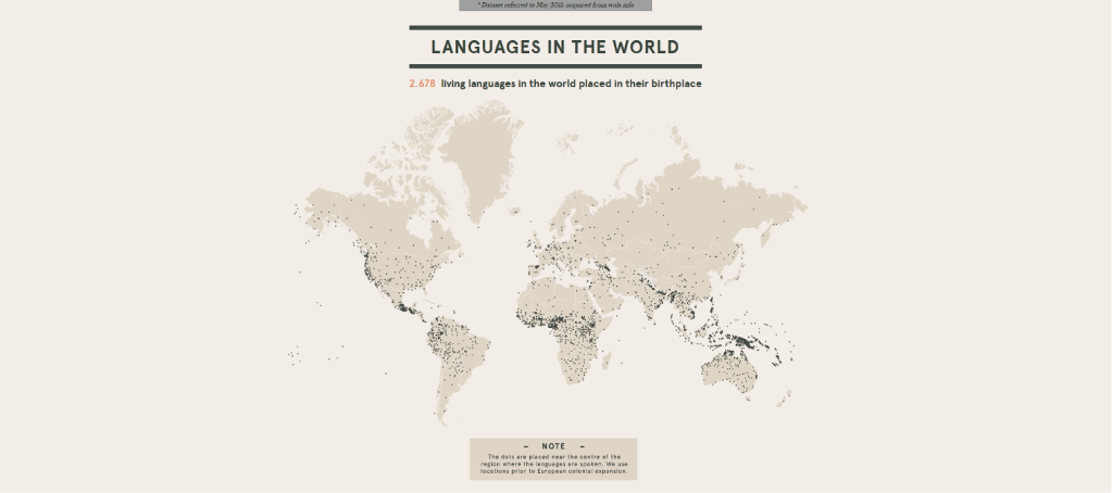
The first example I would like to present of a good data visualization is a dataset from the Density Lab, a software company, titled After Babylon, which displays languages around the world. After Babylon’s webpage displays various graphs, the top one is a great example of a Level 1 data visualization because it provides the necessary information for the viewer to understand the graph. Since only one type of information is relayed, dots are placed on the map in the center of the region where the language is spoken. The graph even notes that they use locations from before European colonial expansion to make the context perfectly clear. This makes this graph an excellent example of data visualization.
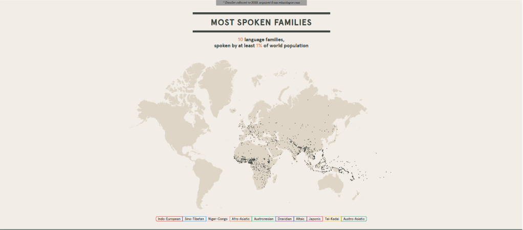
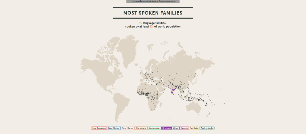
Further down on the webpage is a Level 3 data visualization that shows the most spoken language families on the map. Interactivity comes from allowing the user to click through a menu at the bottom that highlights the dots representing each language family with the color corresponding to the language. This graph also provides context, noting that 10 language families are spoken by 1% of the world’s population. That information alone is not as powerful as it is when displayed on the graph with the context. The fact that the viewer can interact with the graph to highlight different dots makes it more engaging than your average map graph. Thus, making it another good example of data visualization.
https://www.visualcinnamon.com/2019/04/designing-google-cats-and-dogs

A different example of good data visualization comes in the form of a level 4 data visualization, a project by Data Cinnamon, a data visualization and data artist, that was commissioned by Google called “Why Do Cats and Dogs,” which is a giant, beautifully done sentence tree featuring 44000+ questions that people have searched about their cats and dogs. There is complete documentation of the entire process of creating this piece to provide any context a viewer might need. Due to the beauty of the piece and the depth of information it provides, I think this is a very successful example of data visualization.
Conclusion
While technology has been beneficial for data visualization, it also has disadvantages. Keeping the disadvantages in mind helps create good data visualizations. No matter the type of data visualization you create, at any level, what is important is having clear, accurate data portrayed in a way that reflects it without misleading the audience.
References
Friendly, M. (2006). A brief history of data visualization. In C. Chen, W. Härdle, & A. Unwin (Eds.), Handbook of Computational Statistics: Data Visualization (Vol. III). Springer-Verlag.
Used Adobe Acrobat AI to help understand parts of this reading I was having trouble with.
Schwab, P.-N. (2020, December 9). Data visualization: Definition, examples, tools, advice. The Blog of Marketing Agency Into the Minds. https://www.intotheminds.com/blog/en/data-visualization/
Unwin, A. (2020, January 31). Why is data visualization important? what is important in data visualization?. Harvard Data Science Review. https://hdsr.mitpress.mit.edu/pub/zok97i7p/release/4
 Home
Home 